Graph tab
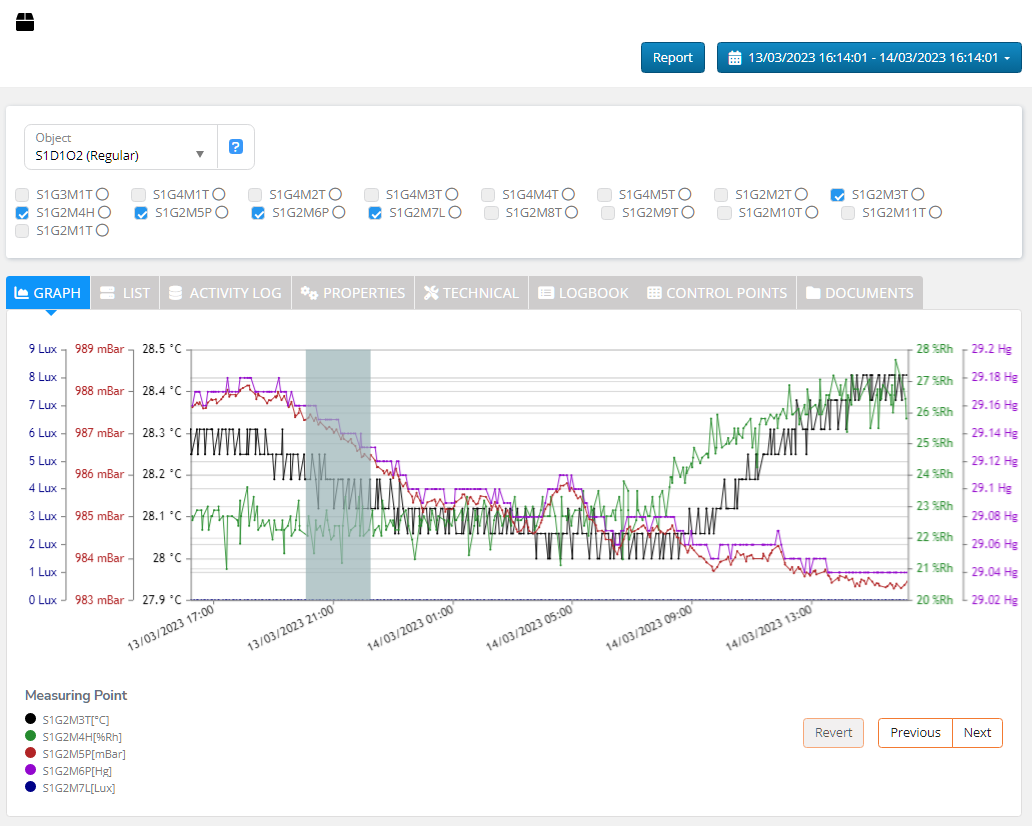
The ‘Graph’ tab presents the measurements’ charts.

If the multiple measuring points are selected as described in Measuring Points selection, then their charts have different colours defined in the Legend in the bottom lower corner. There are also up to 5 different scales if different units are displayed at the same time.

Click ‘Next’ or ‘Previous’ to jump one screen left or right in time.
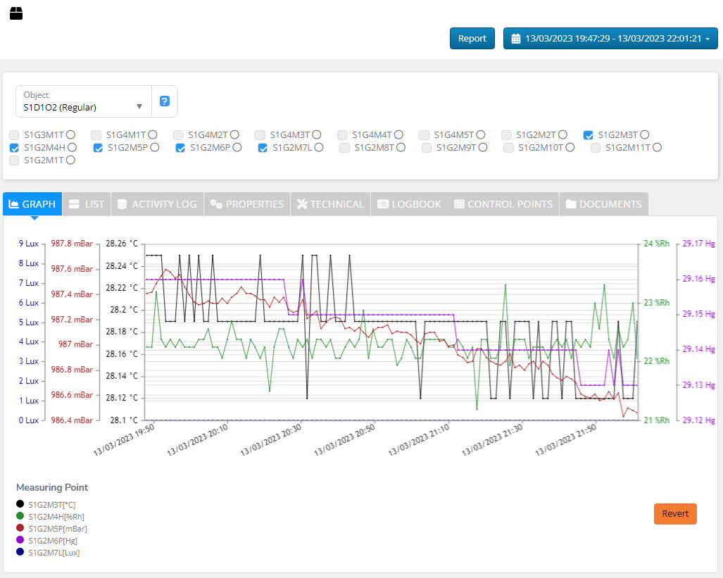
Click and drag on the chart to mark the area you want to zoom in.


Click orange ‘Revert’ in the right bottom corner to close zoom view and return to previously selected time range.
If you hoover the mouse cursor over the chart, then the details of the closest measurement are displayed.

Alarm limits view
If only a single measuring point is selected and it has alarm or warning limits defined then they are shown on the graph.
The upper and lower alarm limits are shown as red and blue lines respectively. The warning limits are presented as yellow lines.

Hoover above the line to see the alarm or warning limit details.

Average value
If a single measuring point is selected, the average value of the readings displayed is shown on top of the graph.
Show All Measurements

If the number of readings in the graph is high, the graph does not show all the measurements. If you want to see all the readings toggle "Show All Measurements" switch.

"Show All Measurements" off

"Show All Measurements" on
Show removed Measuring Points
Click the "Show removed Measuring Points" button to open a list of object removed MPs.


Click "Show" to display the last month readings graph of a removed MP.

Change the time range to go back to the latest readings.
Last updated
